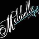
So I need your help on a new logo! I'm rearranging the name to be simply Melibelle and along with this change I'm getting a logo! Since the logo will be what's on your pictures I want your input on which you'd rather see on your photos!! So in the comments please let me know which number logo you like! I'll be sure to share the debut of the new logo in a week or so!! :)
Option 1

Option 2~

Option 3~ it would be the same as option one just on the pictures I would most likely just use it as it is below.

Here is what they would look everywhere else but on the pictures ( the writing has to be white to show up o the pictures), so for example on the web site, any marketing materials etc!

PS isn't my Daddy so cute up there rockin' out?!?! :)


10 comments:
I like option 2!
I had to think hard, but I lean toward option 2!
Ha!! 3 votes so far for option 2!!
I like option 2...i think it has a bit more of a professional look and girl...professional you go!!!
I love option one. colorful and funky.
I like option 1 too. More of your personality in that one!
I was totally going to say the first one. Then I saw all the comments that liked the second one, and thought maybe I was just missing something because I assumed number one was the clear cut winner. So I went back and looked again and stared at them for a while, and what do you know, I think I like the second one better now. Maybe I am too easily swayed???
I really like them both (no help, I know). Option 1 is more modern and fun, but Option 2 is elegant looking. Hard to decide...so that must mean you did great coming up with these 2 to choose from!!
here's the thing to me...i think one fits your personality better. I think if you sell and print photos with your logo on them number two is more professional and does not take the eye away from the photo. Either way...you are an amazing photographer!
I like the 1st one!! And just use the circle with the M! But they are both pretty! But I think the circle is fun!
Jeni
Post a Comment